

PRODUCT DESIGN · MOBILE-FIRST · WEB APP
Product Launch Studio
Designing one focused, private workspace for small sellers, then testing it on a real phone until every confusing moment was gone.
My role
Solo: problem definition, UX/UI, device testing and launch
Timeline
Focused 5-day build sprint · launching Nov 23, 2026
Platform
Installable web app (PWA) for phone and desktop
Tools
Figma, HTML/CSS/JavaScript, Claude for AI-assisted coding, Netlify
01 · THE PROBLEM
Small sellers run their business across five tools and still don’t know what they actually earn.
Products live in one place, prices in a spreadsheet, post ideas in a notes app and launch steps in their head. As a seller myself, I lived this. Three pain points stood out:
Typing the same thing twice
The same product details lived in several places and had to be re-entered every time something changed.
Not knowing real profit
Prices were set without counting materials, packaging, and payment or marketplace fees, so sellers didn’t know what they kept per sale.
Missed steps & subscription fatigue
No single affordable place to track launch tasks and plan content. Most similar tools charge every month.
02 · WHO IT’S FOR
Sellers on any platform, or no website at all.
Creators and small product sellers with digital or physical products, whether they sell on Shopify, another platform, or just a payment link. Most are doing everything themselves and many are on their phone more than a computer.
What they need
“I want all my products in one place.”
“I need to know what I actually make on each sale.”
“I want to plan launches and posts without paying for another subscription.”
“I want my business info to stay private.”
03 · DESIGN GOALS
Four rules every screen had to follow
One place, no re-typing
Enter a product once and use it everywhere: inventory, pricing, promotions and posts.
Show the real number
Profit and margin are calculated from costs and fees, not guessed.
Focused, not crowded
Show what matters now and hide the rest until it’s needed, especially on a phone.
Private, no subscription
Data stays on the user’s own device, sold as a one-time purchase.
USER FLOW
From an empty workspace to a first launch
The main path a new seller takes. Everything they enter once (products, costs, colors) carries through every later step.
Step 1
Install the app and add your logo and colors
Step 2
Add products, or import them from a CSV
Step 3
Enter costs and fees to see real profit
Step 4
Track stock with low-stock alerts
Step 5
Plan posts and sales on the calendar
Step 6
Back up, or restore on another device
04 · WHAT I DESIGNED
Five core areas, one installable workspace
Supporting screens: Platform SEO, Licensing & delivery, Checklists, and a Help & guide page.
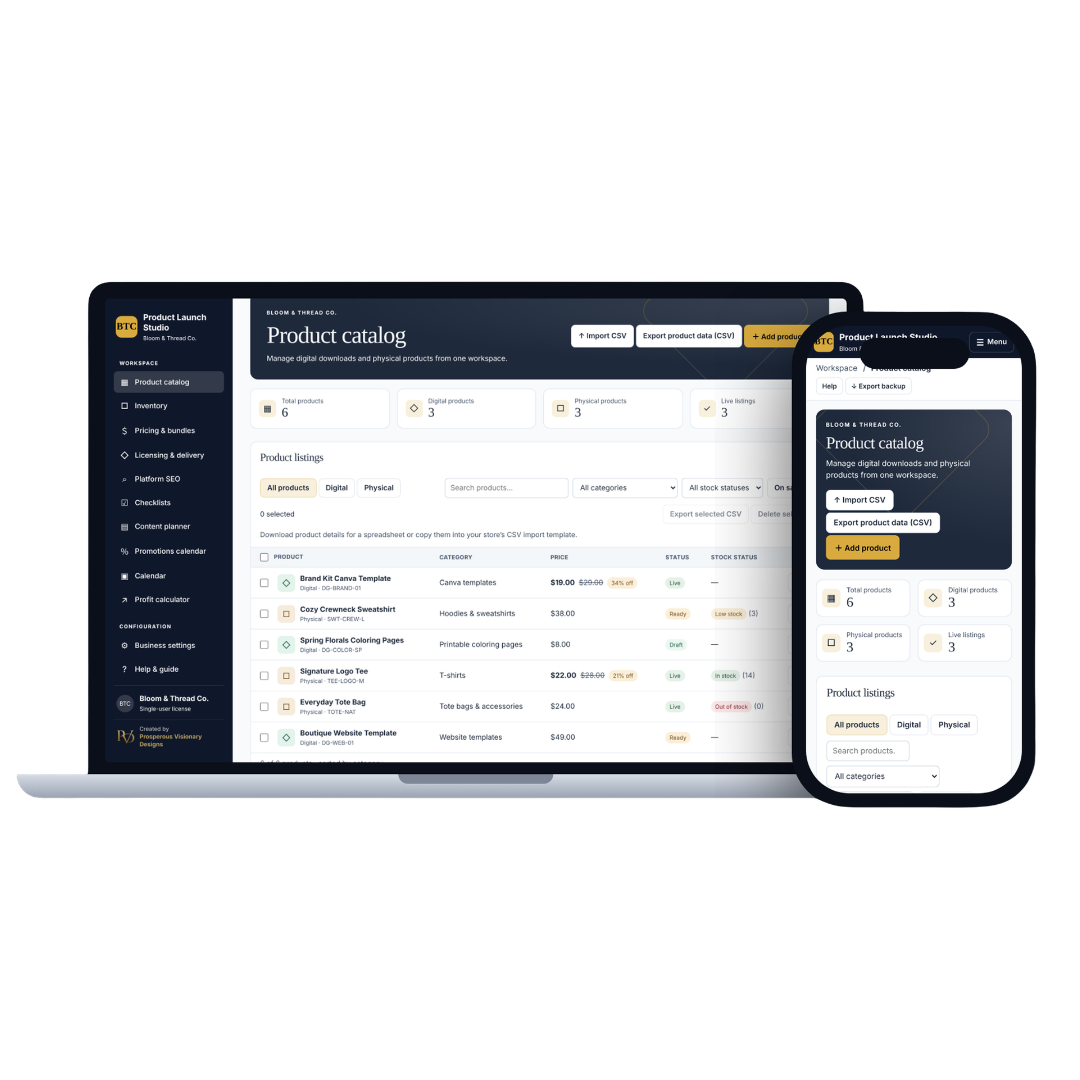
Product catalog
Digital and physical products together, with CSV import and export from a store or spreadsheet.
Inventory
Stock tracking with low-stock and sold-out alerts, plus bulk updates.
Pricing & profit
Sale pricing, bundle discounts and a profit calculator that factors in costs and fees.
Content & promotions calendar
Plan posts and sales on one calendar, then export events to Google, Apple, Outlook or Yahoo Calendar.
Business settings
Your logo and colors theme the whole app, with one-click backups.
Installs like a real app
Pin it to your taskbar or phone home screen and it opens in its own window, with no browser bars. Even the title bar matches the user’s brand color.
05 · TESTING & ITERATION
I used it the way a seller would, on a real phone, and fixed every moment I hesitated.
Starting from a brand-new empty workspace, I walked through setup, importing products, pricing, planning and backups on phone and desktop. Each time something looked broken or made me stop and think, I logged it, redesigned it and tested again.
Honest scope: this round was hands-on device testing by me before launch. Usability sessions with real sellers are the next step.
Category field people mistook for autofill
What went wrong: The field only suggested categories you’d already typed, so on day one it looked empty and read like old browser autofill.
What I changed: Replaced it with a real dropdown of starter and used categories, an “Other / type my own” option, and shortened long imported names.
Product list that broke on mobile
What went wrong: On a phone, the table squeezed its columns until the category wrapped one letter per line.
What I changed: Redesigned the list as stacked cards, then tightened them: status badges on one row, and bulk-action buttons hidden until something is selected.
Navigation that took half the screen
What went wrong: The full menu took up half the screen on mobile, pushing the actual work below the fold.
What I changed: Moved navigation into a slide-out drawer opened by a clear Menu button.
Backups you couldn’t find how to restore
What went wrong: Restore was buried in settings, and dropping a backup into the product importer silently did nothing.
What I changed: Added a Restore button to the top bar, drag-and-drop, and a smart prompt that notices a backup dropped in the wrong place and offers to restore it.
SMALLER FIXES THAT ADDED UP
Empty states
Inventory looked broken before any product existed. Added “Add your first product” guidance.
Buttons that didn’t look clickable
Darkened outlines, added a subtle shadow, and hover/selected states that follow the user’s accent color.
Branded confirmations
Replaced default browser pop-ups, which exposed the hosting URL, with in-app dialogs.
Clean imports & local time
Imported descriptions convert from raw HTML to clean text, and dates use each user’s own time zone.
06 · OUTCOME
Launching November 23, 2026 as a one-time purchase
Everything below comes from my own hands-on testing on real devices. Buyer feedback will be added after launch.
5 core areas
Catalog, inventory, profit, content planning and settings in one workspace, replacing several separate tools.
8+ fixes from testing
Each one came from a real moment of confusion on a phone or desktop.
Private by design
No accounts and no server: business data stays in the browser on the user’s own device, with one-click backups.
No subscription
Sold once, so sellers aren’t adding another monthly bill.
07 · REFLECTION
What I’d tell my next team
Building it showed me what mockups hide
Most of my biggest fixes, like the broken mobile table and the hidden restore, only showed up on a real phone with real data. Now I test on devices early, not at the end.
The tradeoff I chose
Data is stored locally on each device, which keeps it private and free of subscriptions, but means it doesn’t sync across devices on its own. Real sync would need logins and a database. Instead, users move their data with a manual backup and restore, which is why I made restore so easy to find.
What I’d do next
Run short sessions with 3 to 5 sellers after launch, watch where they hesitate in their first 10 minutes, and use that to plan the next version.